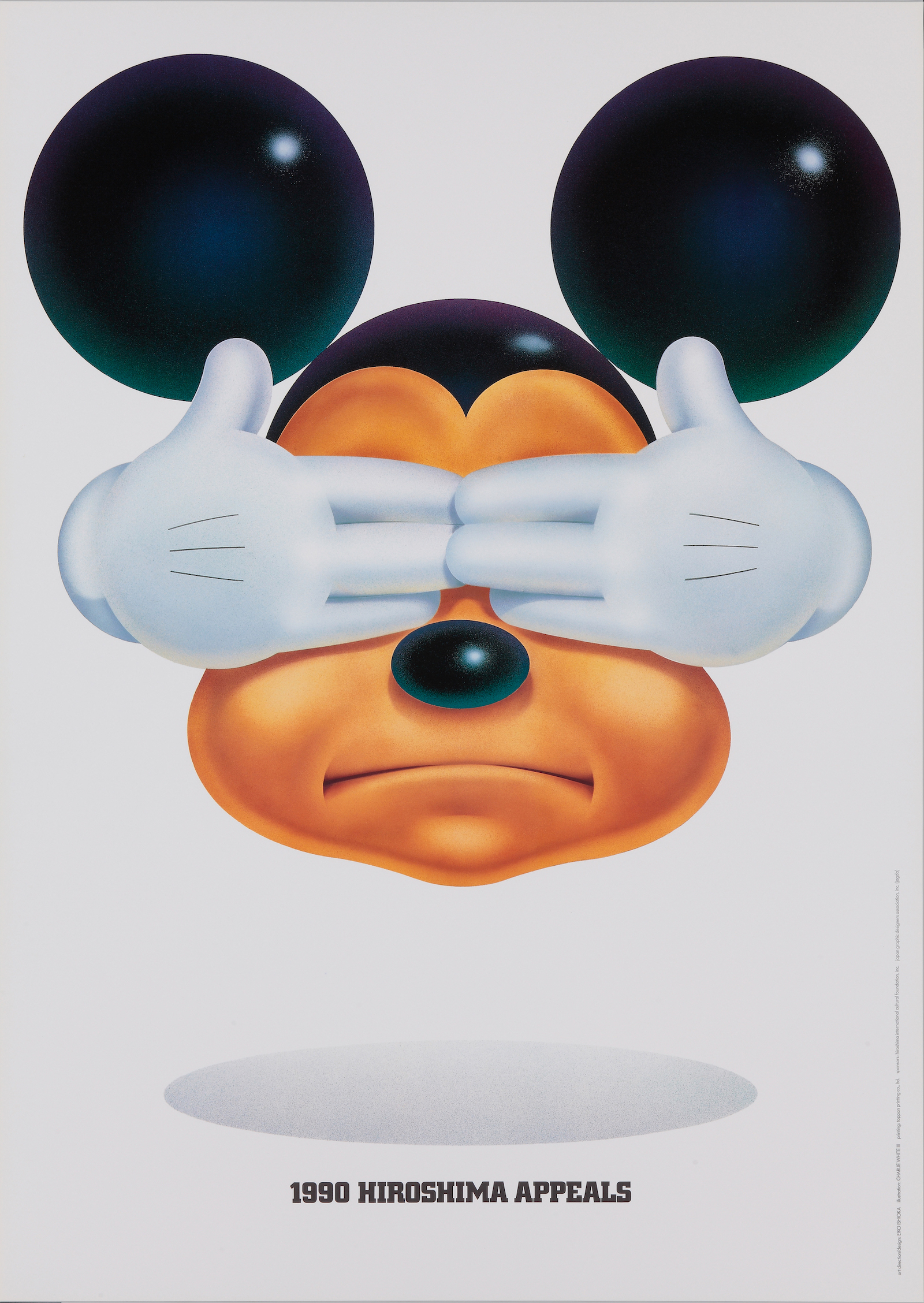
Hiroshima Appeals 1990

Comment from Designer
Today, as the phenomenal developments in information technology keeps us constantly up to date with news from around the world, it has become quite difficult to speak of Peace and the tragedy of Hiroshima through the medium of the poster.
Back in more innocent days, before we dared even to conceive that we might one day have instantaneous access to world developments of every kind, the poster had impact of considerable force. But today, at a time when the poster has gradually retreated to being a primitive means of communication, is it still possible to recover its powerful brilliance?
The task is all the more imposing with a poster intended for worldwide distribution, as it must contain sufficient energy to awaken minds in all corners of the earth. For it is only when every person living on this planet is moved to action that the common goal can be achieved. But when this happens, even the impossible becomes possible.
Faced with the challenge of creating a poster for the 1990 Hiroshima Appeals campaign, I decided to devise an image symbolic of today’s majority. Through use of this image, I hoped to engender a feeling of tension between the poster and viewer. I call the image, which was inspired by Mickey Mouse, “Image X”.
Image X can be anyone: Mr. X, Mrs. X, Ms. X , Master X. In his usual state of mind, image X appears with his mouth wide open, his large and restless eyes looking off obliguely in some undefinable direction, disseminating winsome if meaningless charms. Yet here, Image X appears with his two hands resolutely covering his eyes and his mouth tightly closed, an expression of firm determination.
The poster is intended to make two statements. The first is “We don’t want to see the tragedy of Hiroshima ever again”– a warning against a reoccurrence of the greatest tragedy that ever befell mankind. The second statement is “Closing one’s eyes to the tragedy of Hiroshima is the gravest sin mankind can commit”– an admonition to those who might otherwise forget the lessons to be learned from Hiroshima.
This poster of 1990 needed a look desirable for launching the last decade of the 20th century. I decided to eliminate all artistic or literary overtones in order to covey my message with outspoken conciseness. I was ably assisted in this effort by the talents of Illustrator Charlie White Ⅲ, who vividly realized the exact conception of Image X which I had in mind.
Image X, standing solemnly in bright sunlight, speaks a silent and invaluable message. If it reaches out to all people beyond nationality, race, age, or sex, to incite them to think about the tragedy of Hiroshima, then and only will my aim have succeeded.
Hiroshima Appeals Poster Campaign
In 1983, the Japan Graphic Designers Association Inc. (JAGDA) and the Hiroshima International Cultural Foundation announced their collaboration on a project focusing on the theme “Hiroshima’s Spirit” and launched a poster campaign with the goal of promoting peace at home and abroad. The first poster, entitled “Burning Butterflies”, was created by Yusaku Kamekura, the president of JAGDA at the time. Designers affiliated with JAGDA produce one poster each year.
Size: B1 (728 x 1,030mm)


