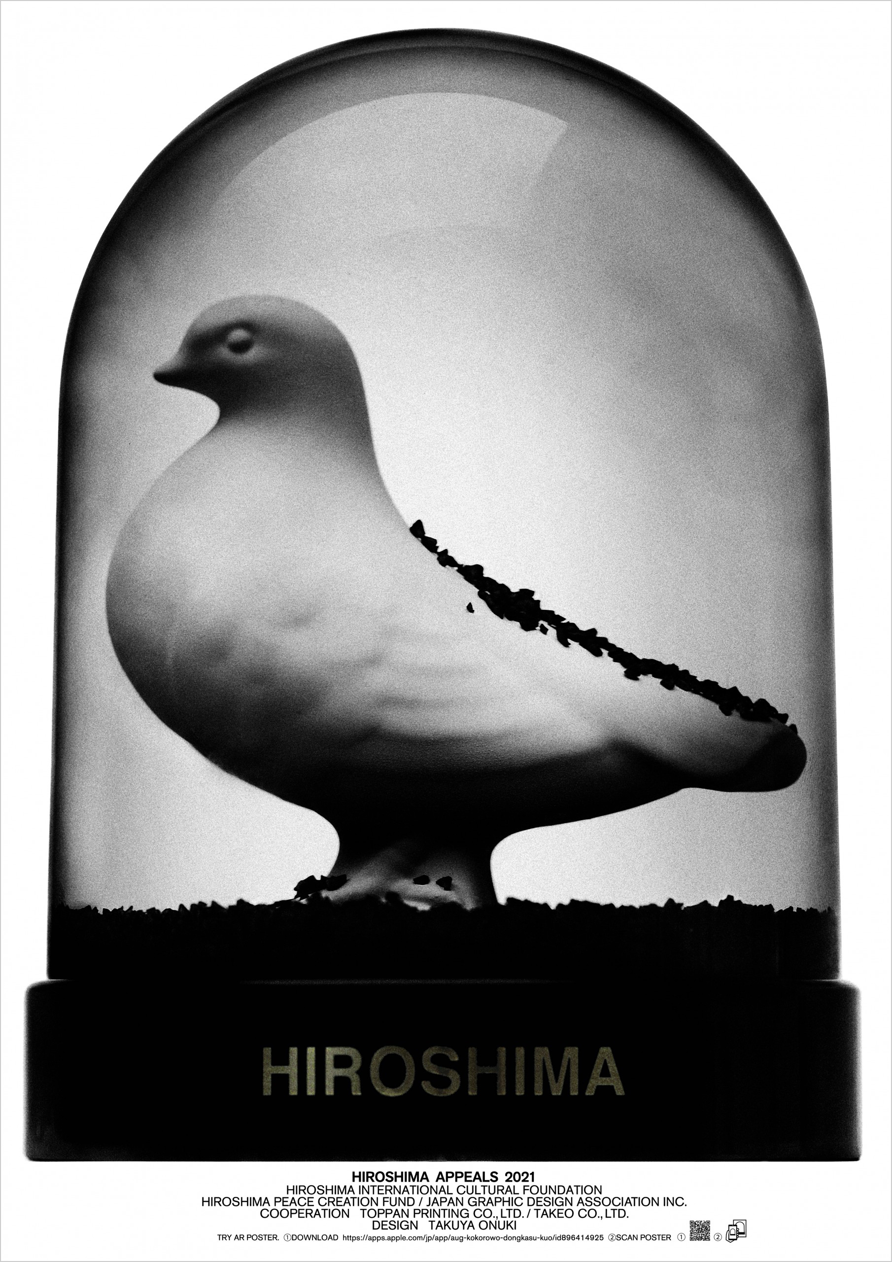
Hiroshima Appeals 2021


Designer’s Comment
For many years, I have made a living by conveying ideas to many people or “advertising.” I believe advertising is presenting a future that is brighter and more fun than today, even if only by a little. However, this time, I felt that the way to help create a more hopeful future is to convey to young people that the threat of nuclear weapons is not part of history, but a very real part of their lives, and, by doing so, ensure that the reality of nuclear weapons doesn’t fade from our minds, but stays etched in our hearts. As someone who works in visual expression, it is very sobering to be involved in the activities of the Hiroshima Appeals, which seeks to clearly inform the next generation of the existence of nuclear weapons amid the continued decline in the number of “kataribe” or people who experienced the atomic bombing.
This year’s poster uses augmented reality (AR). Inside the snow globe there is a white dove, the symbol of peace. Normally there would be white powder in the snow globe, but for this piece, we have black powder. If you place your phone over the photo, it starts to move,* as if time is working in reverse. Eventually, the dome is filled with the black powder, which may bring to mind the idea of peace being crushed by war, nuclear weapons, and “black rain,” etc., and create a real and gut-wrenching sense of war. Ultimately, the black powder falls slowly to the ground, at which point a completely motionless white dove appears.
Conventionally, I believe a snow globe is also a device for making each person viewing it imagine their own story as they watch the snow falling slowly down. My aim, in expressing this work in this way, is to encourage the younger generation, who no longer view nuclear weapons with a sense of reality, to take the time or even just a moment to think and imagine. If I could elaborate further, there is something I want people to notice as they look through the glass and take a bird’s-eye view of war and the atomic bombing – the white dove, trapped in the glass dome, has yet to fly free. I pray for the day when the white dove will be able to fly free in our world.
Takuya Onuki, Art Director
Hiroshima Appeals Poster Campaign
The Hiroshima Appeals is a poster campaign themed on Hiroshima’s Spirit that transcends words to widely convey the prayers and wishes of Hiroshima, which experienced the ravages of the first atomic bomb used on mankind. Since 1983, with the first poster Burning Butterflies by Yusaku Kamekura, JAGDA has designated a member designer to produce a poster each year until 1990, and resumed in 2005 to commemorate the 60th anniversary of the end of World War II. The posters are presented to the mayor of Hiroshima City every year, and were presented to member cities of Mayors of Peace in 2005 and 2008. They were also exhibited at Press Centre of G7 Hiroshima Foreign Ministers’ Meeting in 2016. In this way the posters have promoted peace at home and abroad.
Organizers:
Japan Graphic Design Association Inc. (JAGDA) Hiroshima Chapter
Hiroshima Peace Creation Fund
Hiroshima International Cultural Foundation
Cooperation:
Toppan Printing Co., Ltd.
Takeo Co., Ltd.
Designers:
1983 Yusaku Kamekura, 1984 Kiyoshi Awazu, 1985 Shigeo Fukuda, 1986 Yoshio Hayakawa, 1987 Kazumasa Nagai, 1988 Ikko Tanaka, 1989 Mitsuo Katsui, 1990 Eiko Ishioka, 2005 Masayoshi Nakajo, 2006 Koichi Sato, 2007 Shin Matsunaga, 2008 Masuteru Aoba, 2009 Katsumi Asaba, 2010 Keisuke Nagatomo, 2011 Susumu Endo, 2012 Yukimasa Okumura, 2013 Kaoru Kasai, 2014 Tsuguya Inoue, 2015 Taku Satoh, 2016 Takahisa Kamijyo, 2017 Kenya Hara, 2018 Kazunari Hattori, 2019 Katsuhiko Shibuya, 2020 Yoshie Watanabe


